
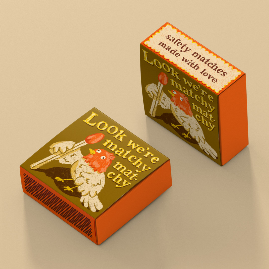
packaging illustration for safety matches box
I wanted to create a safety box design, aimed at people that like to collect products with cute and humorous designs for their home.
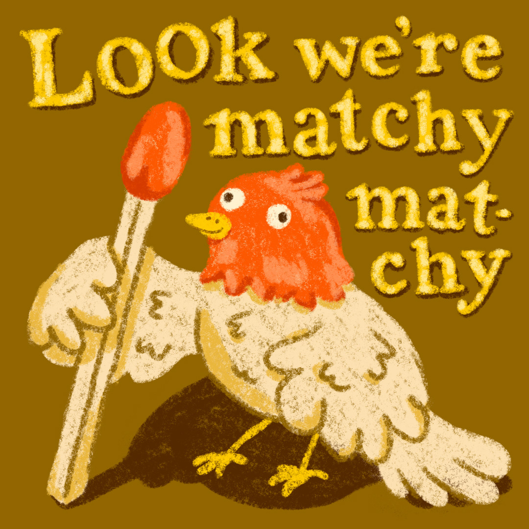
For my concept, I explored the word “match” and thought of funny puns I could create with it. Looking at safety matches, I realized that they often come with this colourful tip, usually in a bright red/orange on a beige wooden piece of wood. So I created a matching bird, drawing it’s head in bright orange and added the line “Look we’re matchy matchy” on top of the composition in handlettering.
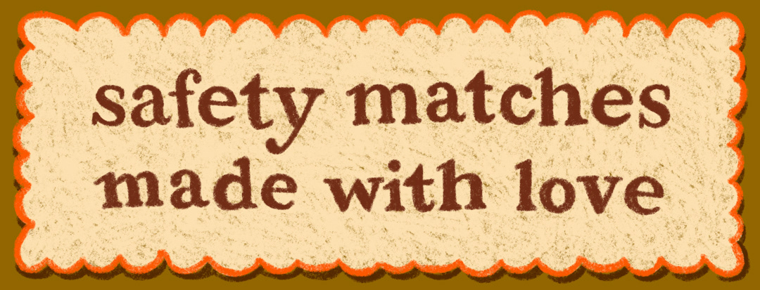
For the side of the packaging, I added the text “safety matches made with love” in the same handlettering style to give the packaging a handmade layer all around.
You like this project and want to work with me?