
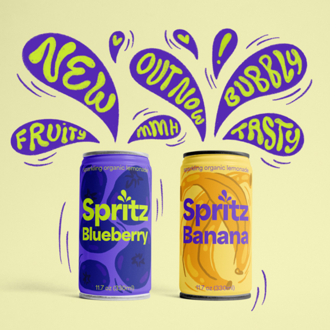
Spritz Lemonade brand and packaging design
I wanted to developed a custom brand identity and packaging design for a fictional organic sparkling lemonade brand called “Spritz”, that communicates freshness, flavor and fun.

Custom logotype
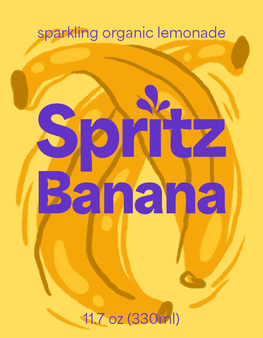
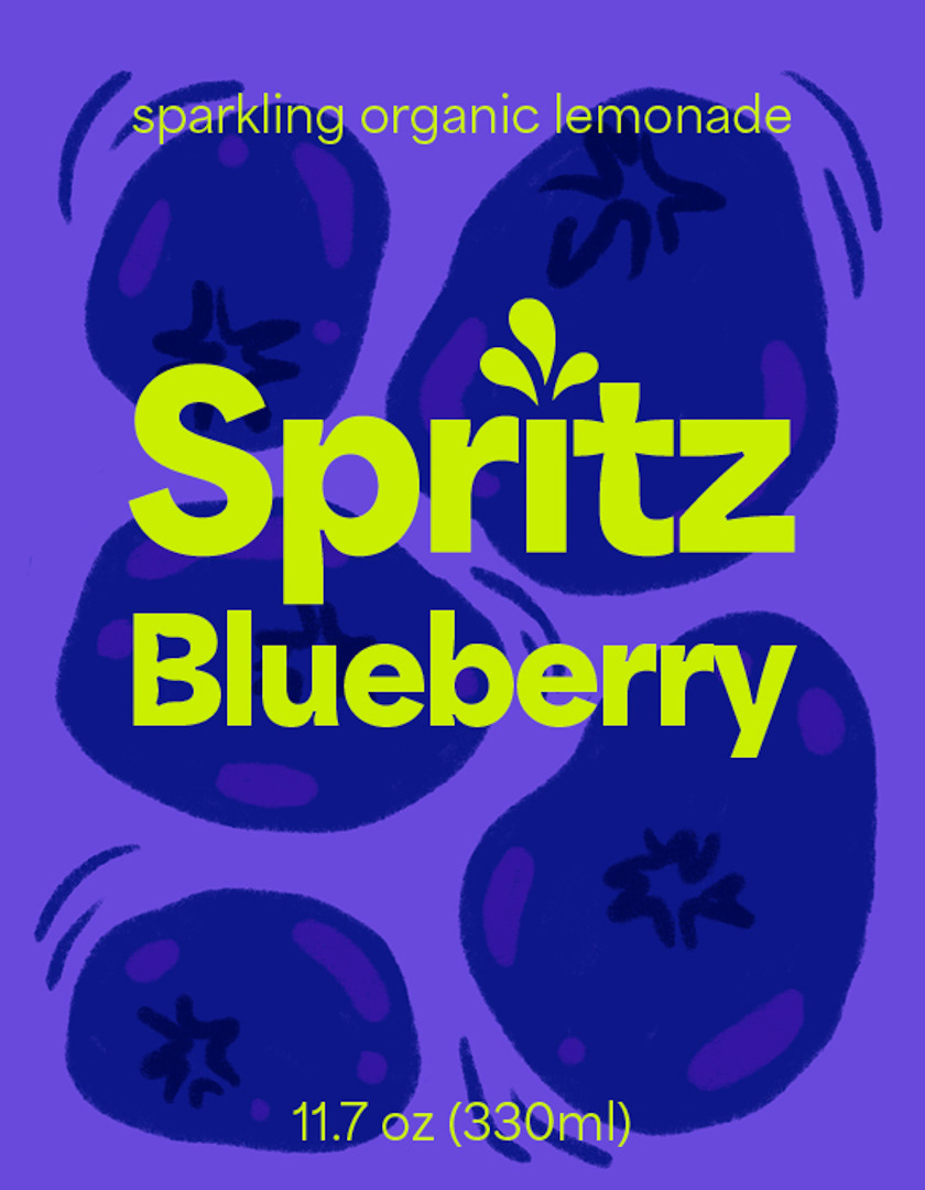
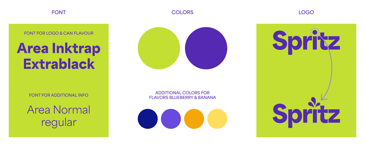
As the brand’s typeface I picked “Area”. Area comes with a set of normal fonts, in addition to the “Area Inktrap” fonts, that are designed with beautiful details in the letter shapes. For the logo I used “Area Inktrap Extrabold” with reduced letter spacing. Then — with adding little splashes replacing the dot over the i — I created a custom logotype, that transports the lemonade’s sparkling flavor not only in its name, but also visually.
Illustrations
Each can features flavor-specific illustrations and colors — deep blues for blueberry, sunny yellows for banana — that I paired with clean typography for a modern, organic look.
With adding lines as elements of movement, my illustration style is very dynamic and therefore a perfect fit for the sparkling lemonade packaging.
Handlettering elements for advertising
For visuals to promote the lemonade brand and the new flavors, I added hand lettered keywords. They add personality and bring
personal project
Do you have a project in mind?